

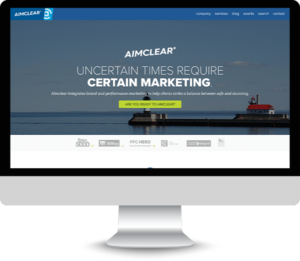
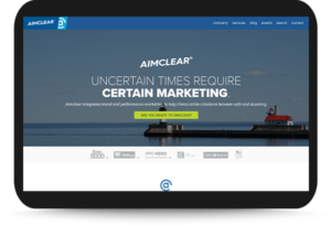
In today’s mobile-first world, having a high-quality, fast-loading, mobile-experience-optimized website is table stakes for success on the web.
Designers can no longer focus design solely for large-canvas desktop users. Mobile has become the preferred method of web browsing, with mobile visits now accounting for more than 50%Â of all web traffic.
Mobile device usage is so pervasive, Google is dropping desktop-layout-based sites from its index entirely, effective March 2021. Only sites with mobile-friendly, responsive layouts will be indexed, ranked and served to users.
Consumers rely more and more on mobile devices to research and make purchases.
This makes it essential for companies to have a successful and strong mobile presence that comply with core usability, design principles and best practices.Â
How web site features are structured and laid out to support all user experiences – mobile and desktop – is essential to providing an optimal user experience. Here are a few tips to support a strong mobile website presence:
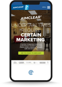
1. Design the layout to be responsive.
Responsive web design delivers multiple, adjustable layouts of the content and design that automatically displays properly based on the device or screen size the user is interacting with. This reduces the hassle of creating layouts for different formats and helps optimize and maximize the ROI of marketing efforts. Having a responsive website enables you to look at the conversion rate by device and often mobile bring’s in a lot of traffic.
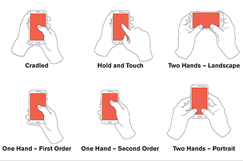
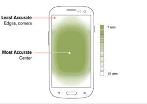
3. Focus on the center – aka the “hot spot.”
Users tend to look at the center of the screen, so make sure the key content and call to actions are centered within the screen and place the secondary and tertiary content and tabs along the edges (such as top and bottom).
4. Place the Call to Actions ordered by importance and make them stand out.
Call to action buttons should be ordered to follow eye movement, from top to bottom in order of priority. Design the call to action buttons to be visually prominent so they stand out against bodies of text.
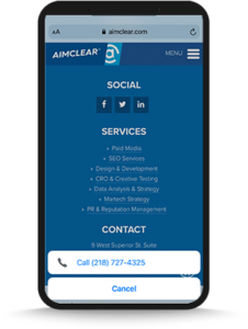
5. Remove the navigation bar.
Of course, keeping the navigation bar on desktop is crucial and important, however real estate is prime on mobile, and so it’s important to maximize the space available.
A simple way to help support and utilize the space is to remove the navigation bar from mobile. This opens up space that may be used for text, or images that help support the website goals.
Try replacing the navigation with a “hamburger menu” that opens up on the side as a navigation drawer.
6. Make sure phone numbers and addresses are linked to device applications.
Take advantage of the interactions available on mobile to help streamline your visitors’ experience. Especially if the website is sales-focused. It’s a priority to make it easy for a user to call.
In the same manner, clicking on the address should open up a visitor’s map application. Setting up these interactions saves the user from having to do any extra work and gets them interacting with your business more quickly and seamlessly.

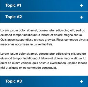
7. Take advantage of collapsible content sections/accordions.
If a page has a large section of text, keep in mind when it’s displayed on a mobile device, a user would be required to scroll… and scroll… and scroll to read the full body. If the content is non-narrative and can be easily organized into different sections or topics, utilizing collapsible content sections/accordions enables the user to skim through the content to find what they are looking for more efficiently.
Â
Remember: Experience First!
Designers and developers can no longer view mobile design as secondary when it comes to web design but instead should be focusing on “universal” design. Designing sites and experiences that equally delight users of any device and platform. More and more however, that means mobile-experience-first.Â
And how users interact with a website on mobile is constantly changing. Be thoughtful and pay attention to detail to achieve a positive user experience.
Reach out to us if we can help design a web presence for your business that serves your customers’ expectations and your business goals equally!


