

Web design is not all about being perfectly technical, but about making the experience pleasurable for the visitors. Sometimes brands are distracted by cutting-edge design and forget web design best practices. According to a study that was conducted to ascertain the speed of determining the visual value of a website, it takes about 50 milliseconds (.05 seconds) for a user to form an opinion about a website and 94% of people judge the credibility based on a website’s design.
Web design is the very core of how a website presents itself. Although design visually is subjective, aesthetics can be achieved if elements are thoughtfully placed according to certain principles. Aesthetics should work in harmony with the functionality of a website and the content laid within and should support and enhance it. All elements must work to create a singular experience. Incorporating visual aesthetics in a website and providing a good user experience will determine how everything is visually presented.
Let’s review the following web design best practices to focus on the intersection between creating a stunning website and one that supports a business.
Web Design Best Practice #1: Create Unity
When it comes to web design, unity helps the user navigate through the website seamlessly by linking the elements and content creating a relationship between the two so the viewer sees them as a unified, single entity. The concept of unity holds the structure of the website visually, and conceptually.
Elements on a page should be placed in a thoughtful manner to make the highest impact, directly or indirectly emphasizing the main message of the website. Every element should have a purpose in this unified framework. Removing the mishmash and creating unity within a website, helps designers create order within a website layout. This makes everything easier to perceive, consume, understand, and act upon.
Web Design Best Practice #2: Balance
Balance refers to allocating the various elements consistently, and in a visually balanced manner. Adhering to the balance principle can help visitors navigate a site with greater ease and purpose. Visual balance ensures the site looks clean and effortless.
Web Design Best Practice #3: Space
Similarly, all elements on a web page should be evenly spaced so the viewer can easily differentiate sections. A visitor also needs some “breathing room” as their attention moves from element to element. Spacing provides essential cues for the brain as it makes sense of the information being taken in.
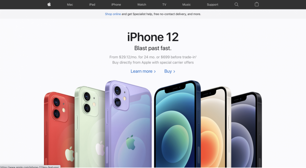
Apple’s website showcase’s a good use of balance and space. Their clean aesthetics lead’s the user to their destination in a straightforward manner.
Web Design Best Practice #4: Visual Considerations
Focal Point
There can be many areas of interest on any given webpage, but there needs to be one area on a page that grabs the user’s attention the most. Think of it as the headline of a news article. The focal point is the area on a website that is the main object that should grab the user’s attention and establish purpose. The focal point is essentially a starting point for the user’s journey. To help guide that journey, the designer needs to define a hierarchy of the various elements. Focus first on the aspect of the page that captures the interest, then build the design structure to flow from that core. Capturing and maintaining interest is essential for a high-power website.
Color
Colors have meaning. Colors portray a tone and make an emotional impact to help a website stand out against competitors.
A simple color change to a functional element can drastically influence the performance of a website. When color is used constructively, it can play a crucial role in branding and product messaging. Color not only helps build the relationship but creates a connection between a website and a product. Research on how color impacts visual experience found that 92.6% put high importance on the item’s visual factor.
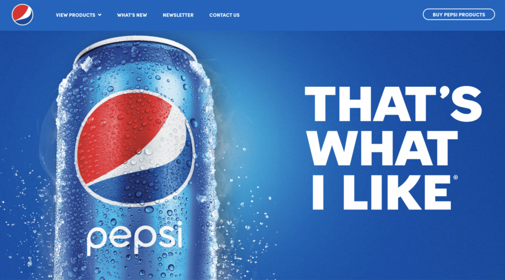
Pepsi does a great job being consistent between its website and its products.
If a website needs a color scheme designated, keep it simple by choosing a primary, secondary, and an accent color to avoid visual overload. While choosing the color scheme, be conscious of what the viewer sees and how you want them to feel.
If a website has a designated color scheme, oftentimes there’s a color within the scheme that doesn’t work well. However, there is almost always a way to work with tough colors. For example, if there are bright colors that need to be incorporated, be generous incorporating whites, blacks, and other neutrals.
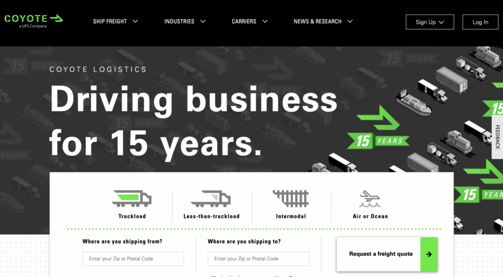
As seen below, Coyote does a great job incorporating their bright green throughout their site without it being overpowering and using the green to draw attention to specific elements on their site.
Here are some color tips:
- If there is a bright color that is just “too bright” to be used as the background or text color, utilize it as the call-to-action button color or highlights on the site.
- Dim color’s down by using shading to add black to darken it, or tinting by adding white to lighten the color a bit, or toning it by adding gray to neutralize the color.
Color Contrast
Another way to add interest to a webpage is by incorporating color contrast, which is incorporating two different colors that are opposite of one another. The more the elements are different from one another the easier it is to compare and understand. Be cautious that the font contrast is optimal to meet accessibility requirements.
Formatting
It’s safe to assume that the user has viewed countless sites and that the user will have a preconceived notion of what to expect when landing on the website page. Following certain formatting standards is a great way to accommodate the expectations of the user. By ‘standards’, it is meant that about 80% of websites use a similar design approach, including:
- A clickable logo in the top left corner.
- Main navigation that goes across the top of every web page
- Value proposition located “above the fold”. Generally, the prime elements should be visible to the majority of visitors without scrolling.
Technical proficiency with web creation and web design is important. The real magic happens when brands can blend technical prowess with powerful design capabilities. Creativity and style that work in concert with the technical aspects of the site can have a huge impact on the final outcome. Remember – always keep the site’s overall purpose in mind and ensure that the elements of the site serve a purpose that moves audiences to action.
Reach out to us if we can help design a web presence for your business that serves your customers’ expectations and your business goals equally!


